Makenna Wynveen
Norðurljós Bilberry Rosé Wine
Fall of 2018 - Creative Brief
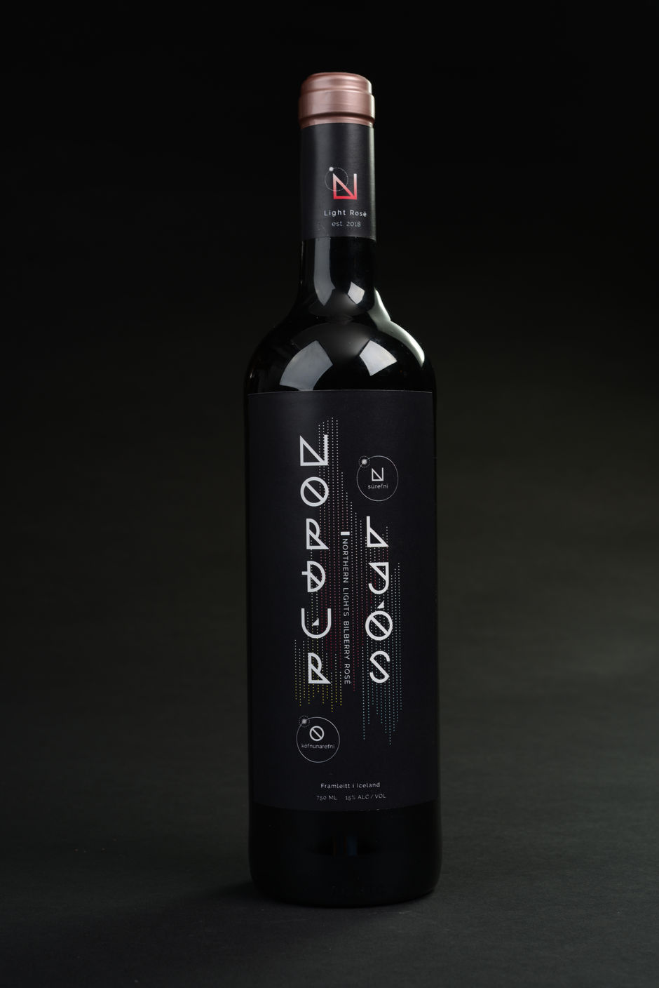
WHAT - I created the packaging design for a wine bottle that can be found in Iceland and in the United States.
WHY - While the Northern Lights may be a common sight for Icelanders, they still provide a sense of wonder and especially to those who have yet to view these spectacular dancing lights. Many people are in awe of these lights but may not know the reason as to why they appear. With this packaging, I will provide the science behind how the Northern Lights emerge.
HOW - Native or not to Iceland, the Northern Lights provide a sense of bewilderment. Instead of solely basing the design off of the lights colors, I incorporated the science of how the lights appear into the label to add more intrigue for consumers. I drew inspiration from the varying colors in the Northern Lights, the dark night sky they dance in, the scientific diagrams of the reaction taking place when the lights form, and the old Icelandic language, Runes. I chose a dark bottle to echo the night sky. I made my own type logo for Norðurljós, for the logo mark, and for the Nitrogen and Oxygen symbols, all based off of the Runes typography. I then created dotted rays with a gradient to mimic the color and movement of the Northern Lights. All of these design elements combined provide a fun new learning experience on how the Northern Lights emerge.
*New Talent Annual 2020 award on Graphis*
*Listed on Packaging of the World*

Ideation Process


